PortPoly: GUI Revamp

So, i've been brewing on how to evolve the GUI and have landed on a new design.
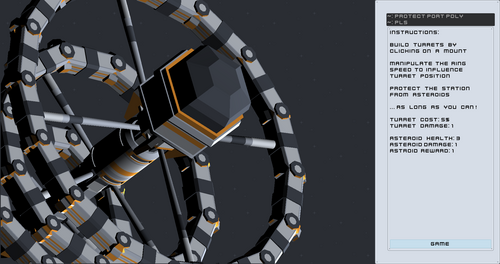
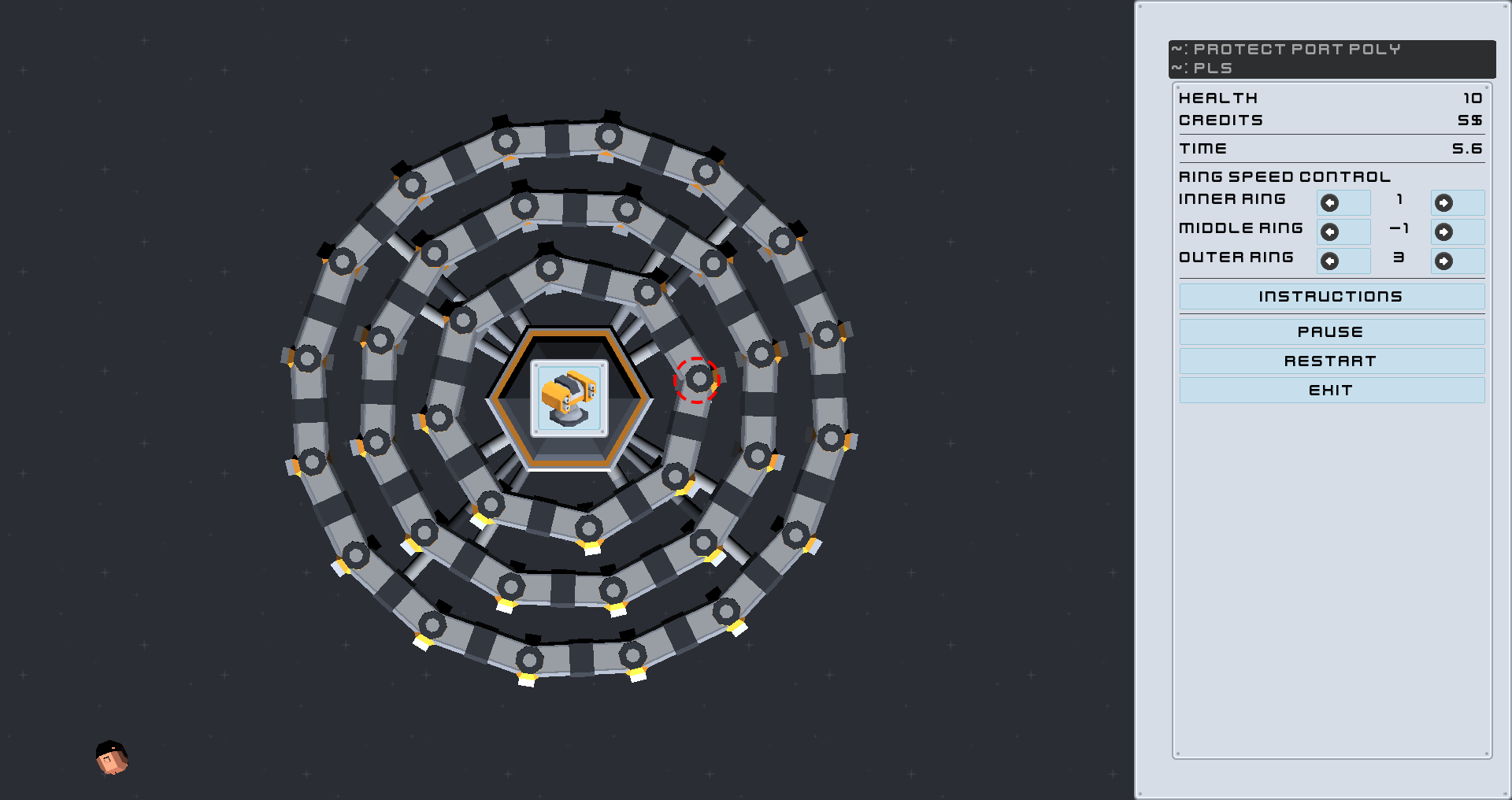
As nice as the existing ratio is, it really doesn't do much for the actual game:
Health, money and score/time are far off the side, but all in one place so you always have to double check whether you are looking at the right thing. Additionally, all the controls are cramped into there as well.

As you can see above, there is basically no information on the turret cost, and if i should add another turret type - which i want to do anyway - there is basically no space left.
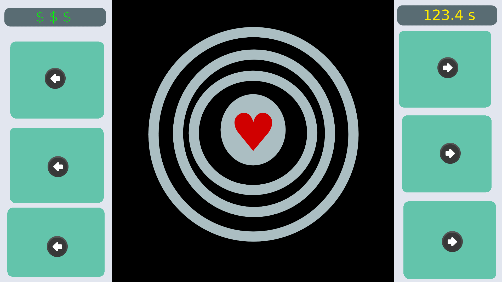
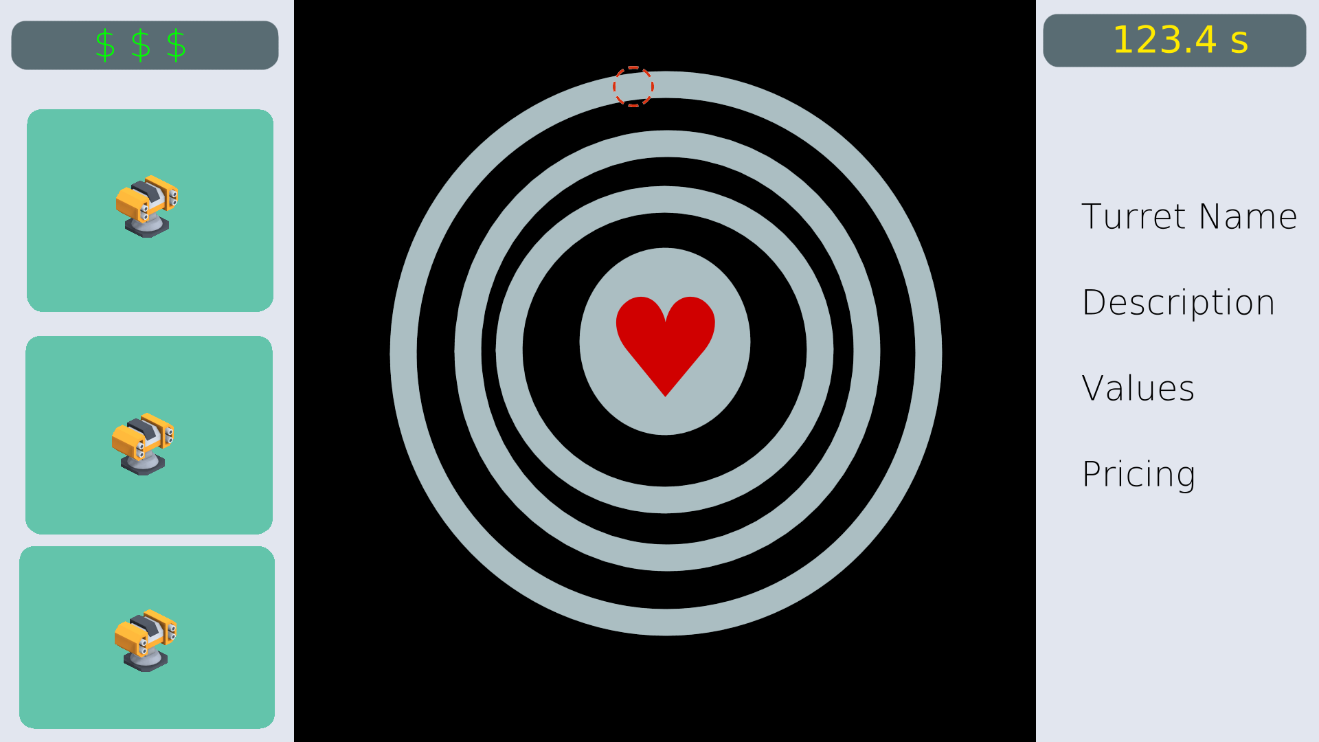
So, i decided to go forward with keeping the current separation in the main menu, but to go with a GUI panel on both sides of the gameplay. This allows the station to be finally centered, while it allows various pieces of information to be moved in different corners, so you can read them at a glance: Health moves to the center, money top left, score top right.

The now free space on the other hand should go to what's most important... and that's the ring rotation control and turret purchase interface!

Why such big buttons? Well, for one i wanted to keep a 1:1 ratio in these mockups, and there wasn't much to fill it with. Probably a few extra bits of informations, a menu/exit button and whatnot will find their place there eventually. These images are just to convey the idea.
Secondly... with the station as is, there is already going to be a lot of detail on there the eye needs to pick up. I plan on packing availability-of-buttonpress information, like highlighting or greying out, onto those buttons. The player should be able to see at a glance which ring is currently selected via hotkeys to change speed, or whether they can afford a turret or not.
Finally, a proper pause/escape-key-menu is going to be added, which leads to a new settings-menu (audio, graphics), and boiled down instructions. The attribution and credits are going to move into the main menu, given that it is otherwise empty then.
See this Github issue for further details on this topic.
The next step is going to be revamping the node structure in the Godot project, so i can add these GUI-elements in their proper places.
Get Protect Port Poly, pls
Protect Port Poly, pls
Place towers to defend the space station against asteroids!
| Status | Released |
| Author | Wrzlprnft |
| Tags | Sci-fi, Singleplayer, Tower Defense |
| Languages | English |
More posts
- ... What happened to this?Dec 06, 2021
- Devlog-Thing: What's the plan?Aug 30, 2021

Comments
Log in with itch.io to leave a comment.
Cool to see you're still working on the game! Keep it up :)
Thanks! It looks like i only have an evening or two a week to work on it, so it might take a while.